Summary
Impact Mozilla’s present goal (now that they have finished shortlisting 10 finalists) is to get as many users as possible to vote and select the best marketing plan that will help them increase Firefox retention rates.
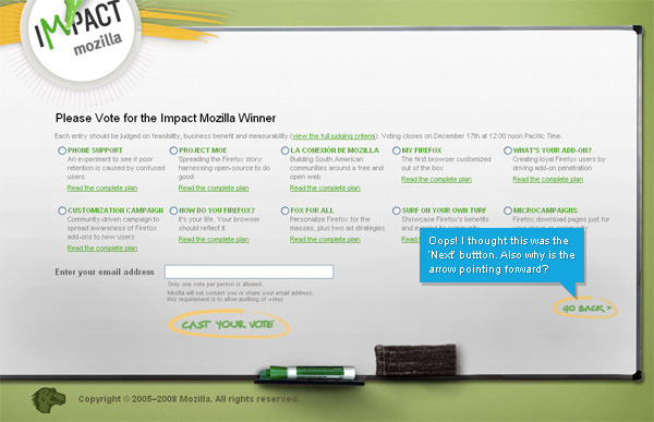
Unfortunately, the placement of a ‘Go Back’ button, on the page that the users cast their vote, will lead to an unnecessary number of users dropping out of website without casting their vote.
What is the issue?

The placement of the ‘Go Back’ button is an issue (yes, it does not look like a button but does draw the user’s attention towards it though easier paths for the eye to follow could have been established). It’s been placed, as you might have guessed, where a ‘Go Forward’ or ‘Next’ button should be placed. Secondly, you have an arrow placed right of the label, which points to the right. This arrow means, ‘that way forward’, and not ‘that way back’.
When you turn the page of a book, to go to the next page, it’s the right page you flip, you want to go back- you turn the left page. The browser back button is placed to the left and the browser forward button is placed to the right. If you want to go to the next page, you click ‘forward’ and if you want to go back to the previous page, you click ‘back’. Left is mapped in your mind for back and right is for forward or next.
The placement of the ‘Go back’ button here will thus interfere with the user’s mental model of a ‘back’ button which will result in a number of accidental clicks upon it by users, more so if the user selects any of the radio buttons towards the right side of the form (or board).
Why is this an issue?
Take the case where users arrive for the first time on this website from a link telling them about the website urging them to vote. This is more applicable to intermediate and expert internet users since they skip a lot of information and take action, while novices then to read more and then take action).
Once they reach the voting page and select a radio button (especially the ones placed towards the right side), then there is a chance that they do not fill up their email address and click on the ‘Cast your Vote’ button. Instead, they might click the ‘Go back’ button because they expected a ‘Next’ buttons there instead, and thus click it, without reading the button label at all.
At this point, users might either not understand what has happened. They might think their vote is submitted and they’ve not been notified, and just leave. If they understand that they accidentally clicked on the wrong button, they will have two choices. One, to go back to the voting page and see what they did wrong, and try taking the correct course, or two, simply not make any effort, and leave.
This will reduce the form completion/ voting rate or increase the dropout rate, unless you strongly think that 100% of the users who accidentally hit the back button will go back dutifully to give the voting another try. Since this is Mozilla, we’re talking about a huge number of users voting, and hence even a tiny percentage can translate to a huge number.
How many dropouts will this result in? I don’t know. But analytics can accurately determine this if they go ahead without making any changes to the design. But however few dropouts there may be, it’s definitely worth avoiding them, especially when the level of effort involved for correcting this issue is absolutely minimal.
What’s the solution?

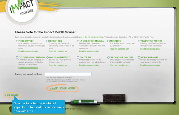
Placing the ‘Go back’ button to the left of the ‘white board’ will ensure that users don’t accidentally click on it taking it to be a ‘Next’ button. Going further, subtly highlighting the marker circle around ‘Cast your vote’ with a little more saturation in color will help attract the user’s attention to the button. With such little effort, voting drop outs (whatever the number, small or large, may be) resulting from the confusion of an incorrectly placed button can easily be contained.
What are your thoughts?

Leave a Reply