Summary
In the Google Chrome browser, once the default width of open tabs exceeds the width of the tab bar, tab width continually reduces with every further tab opened.
This makes it tougher for the user to select an inactive tab using the mouse without accidentally clicking on the close button instead (which resides within the tab of continually reducing width).
This usability issue that comes into play with an increase in browser tabs can be eliminated through a simple solution.
What’s the issue?
In Google Chrome, the width of the tab begins to continually reduce once the combined default width of tabs exceeds the width of the tab bar.
This basically means that after a certain number of tabs are opened by the user to view web pages, in order to accommodate all the tabs in the tab bar, the width of the tabs begin to reduce. More the tabs opened, lesser the width of the tab.
Default tab width in Chrome

The default width of the tab is around 208 pixels. The close button occupies 12 pixels of width on mouse over (when the mouse is placed above it). Here it occupies approximately 1/17th of the tab width when the tab width.
Reducing tab width

At a resolution of 1280×800, the combined width of the tabs at their default width exceeds the width of the tab bar, the tab width noticeably begins to reduce once more than 6 tabs are open.
The image above shows that the width of the tab has reduced to 176 pixels (from it’s default width of 208 pixels) when 7 tabs are open.
Reduced tab width increases error rate

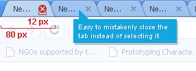
The above image shows further reduced tab width when 17 tabs are open (at a resolution of 1280 x 800).
With the width of the tab reducing, the chances of the user closing an inactive tab instead of selecting it keep increasing. This is because the width occupied by the close button of the tab stays constant though the width of the tab continues to decrease
The width of the tab is now around 80 pixels wide. The close button now occupies approximately 1/7th of the tab width as compared to 1/17th it did earlier- increasing possibility of error in inactive tab selection through the mouse.
What’s the solution?
A solution within the existing implementation of tabs

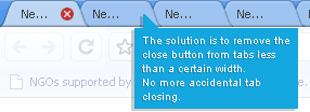
A solution as simple as it is effective is- Do not display the close button on inactive tabs beyond a certain width. Rather, display the close button only on the selected tab. This eliminates the very possibility of the user accidentally closing the inactive tab with the mouse instead of selecting it.
An alternate solution- implementing for scalability and a good user experience
While the above solution addresses the issue effectively, tabs in Google Chrome don’t address scalability very well. A good example of tab implementation that addresses scalability can be seen in Firefox.


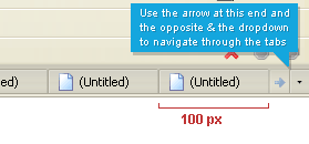
When the combined default width of the tabs exceeds the width of the tab bar, the tab width decreases to a certain width.

After that certain minimum width is reached, the tabs don’t become any lesser in width. Instead two arrows appear at both ends of the tab bar that can be used to navigate through the tabs. The other tab navigation option is to use the dropdown located at the right end of the tab bar that appears immediately and stays once at least two tabs are open.
If you put your mouse on the tab bar, you can use the scroll wheel to shuffle through the tabs quickly. A minimum width also makes it easy for the user to read a portion of the web page title in the tab, unlike Chrome, where this facility begins to wane with an increase in number of tabs are opened.
Your thoughts
What are your thoughts about tabbing in Chrome? How does it compare to tabbing in Firefox, or any other browser for that matter?

Leave a Reply