
Summary
Balsamiq Mockups is an reasonably priced application for creating wireframes that is easy to learn and use suitable for smaller projects. Creating interactive prototypes out of Balsamiq wireframes is now possible with the release of another application called Napkee. This review talks talks about:
- Balsamiq Mockup specifications
- Balsamiq’s distinct visual character and how it works both in favour and against Balsamiq being adopted by users
- Pros and cons of the application
- A conclusion with a recommendation on who should use and what to use Balsamiq Mockups for
Note
This review is based upon the latest Balsamiq Mockups available at the moment- version 1.6.25. Line-throughs (like this) indicate notes about the earlier version.
Specifications
Balsamiq Website: Balsamiq Mockups
How much does it cost? $ 79
Number of controls in UI library: 66 73
Download user contributed Balsamiq UI components: Mockups To Go
Application: Available as an installable. A web application is in the works. Also available as a plugin for Confluence, JIRA, XWiki & FogBugz.
Platforms: An Adobe Air application, hence runs on currently Windows, Macintosh and Linux. Balsamiq Mockups will be cross platform once the web application version is out.
Characteristically Balsamiq
Lets first talk about Balsamiq’s distinctive hand drawn style that makes it look like a scanned paper prototype. What can be seen as Balsamiq’s defining characteristic that differentiates it from other wireframe and prototyping applications- the unconventional hand drawn style and the character of the application, works both as an advantage and disadvantage for it.
1. Unconventional style as an advantage
1.1 Balsamiq- The visceral aspect
![]()
What strikes many immediately about Balsamiq Mockups is its (well implemented) sketchy hand drawn styling and its cheery character. It is the visceral aspect where Balsamiq Mockups scores, allowing it to make a good quick first impression with many a user, who do not mind trying it out with a positive mind or spreading the word on it. It is a popular application talked about and recommended in the interaction design community, despite (as I discuss ahead) the fact that it does not possess (a deliberate decision I would think) the features that would make it an efficient tool to use for the more seasoned interaction designer or information architect.
1.2 Discussion stays at blueprint level without detracting to styling of elements
A wireframe is used to communicate the basic structure (layout and interactions, flow, not content) and working of a product before heading on (optionally but ideally) to higher fidelity prototypes, visual design and subsequently to the development of the product itself. The wireframe is discussed with various stakeholders and constantly refined till it reaches a stable state where the basic structure can be frozen and the team can move ahead to a lower level of detail.
This process can be time consuming and while the scope of discussion of the wireframe should be limited to what wireframes are designed to communicate- the basic structure, in reality, this is not the case. Almost all wireframe and prototyping applications allow for the possibility of moving the wireframe from a basic structural indicator towards a graphically stylized mockup (whether or not it is intended to indicate the visual design of the product). As a result, it is not uncommon to find that time and again stakeholders stray from discussion on basic structure and comment about graphic design which the wireframe is concerned with at this stage.
This is where Balsamiq scores again. Creating a wireframe to move beyond basic structural indication in Balsamiq is practically out of scope (unless you want to load up a hundred images). This ensures that the wireframe is taken and discussed as a wireframe, and there is no possibility of critique on look and feel. In Balsamiq, the only style here is the hand drawn style and there is literally no possibility of stakeholders confusing it for the actual design of the product.
2. Unconventional style as a disadvantage
In his session for MIX ’09, Dan Roam, (author of the book- The back of the Napkin) says “I do not know the cognitive reasons behind this, but I have never seen this not be true. The more human your picture, the more human will be the response”.
While this may be the case, enjoying the benefit of encouraged participation in wireframe discussions can occur only once the application is adopted by the user. Prior to this, a decision has to be made on whether to adopt the application or not, and in Balsamiq’s case, just as the visceral aspect works in its favor, the same sketchy rendering and cheery character could lead to Balsamiq being rejected by users.
In a consultancy, one may consider whether all clients would prefer being presenting with wireframes rendered in a sketchy hand drawn style in comparison to the standard lines and boxes that they are used to seeing. Based upon the unconventionally light natured visual character of the application, a client may view the consultancy as not being as professional or capable as they otherwise took it to be.
Similarly, for internal use in a product based company, especially those at or below stage four of Nielsen’s Corporate Usability Maturity model, where a considerably stable usability group is yet to emerge, usability practitioners will want the company to take usability as seriously as can be taken. In such a scenario, using a tool to create wireframes (in a hand drawn style using a presentation feature with a big cartoon like pointer) that will be discussed by stakeholders beyond the user experience department brings the concern of other departments not taking the usability group seriously enough.
Since the problem is with perception here, you should find it helpful to convince them by letting them know that a giant like Microsoft also chooses to use a similar hand drawn sketchy style in SketchFlow which is a as part of their Expression Blend product.
Balsamiq Mockups- pros and cons
While there are many other points that I can add to both lists, these are the ones that I feel are at the major ones.
Pros
- Easy to use and a low learning curve
- Balsamiq has been kept fairly simple and has a low learning curve and it is easy to get considerably productive right away.
- It’s widget library
- Balsamiq Mockups provides a fairly well stocked UI control library that will let you wireframe with ease. You will find iPhone controls present as well.
- Community shared controls
- Mockups To Go is a user-contributed collection of ready-to-use UI components and design patterns built using Balsamiq Mockups. This is handy in helping you speed up work since there is always a possibility of finding a part or whole of the wireframe you need to build already available for you to download and customize.
- Reasonably priced
- At $ 79, the price is good for everybody, there is nothing more to say.
- Responsive customer support
- While I have not required required any customer support or requested for any new features, customer service is an aspect that Balsamiq is known to perform well in. I have heard users rave about the fact that Balsamiq is extremely responsive to its users, always hearing what they want and responding to their needs and issues.
- ‘Quick add’ is useful
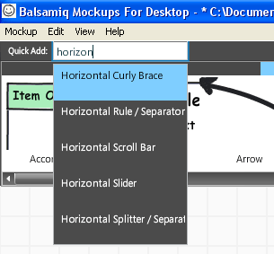
- Quick add is a useful feature that lets you find the widget by typing in its name instead of having to go through the various categories of controls that exist. Of course, the labels given to controls may differ from the ones you use and this may limit its effectiveness but this continually reduces with time spent on the application
- Presentation Mode
- This is useful when presenting the wireframe to stakeholders, especially with the newly introduced ability to toggle annotations in presentation mode.
- Interactive Prototypes through Balsamiq
- This is in the works and yet to be released. With the release of the third party tool called Napkee, users will be able to use Balsamiq to create interactive prototypes.
Cons
- Absence of the ability to Zoom and Pan, create custom controls, no concept of masters or backgrounds and multiple pages
- Besides other features required by more experienced interaction designers and information architects to execute and manage their their work both quickly and efficiently, the absence of these features slows work down and makes it unideal for large-sized projects.
- Memory usage over time shoots up
- In all fairness, this is an issue Adobe needs to address in the Air Application and there is nothing Balsamiq can really do about this.
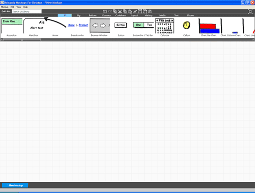
Notepad Background image stretchThe background image vertically stretches if you increase the height of the mockup instead of simply vertically tiling a seamless pattern to make the notebook background. Adding a seamless tile vertically would have made much more sense.Replaced by a neat and clean grid now.
Conclusion- Who should use it, what to use it for and when to use it
Balsamiq Mockups is a reasonably priced, easy to learn and use wireframing tool that comes with limited features. Based upon these simple facts, I wrap up saying:
- Since Balsamiq Mockups application has been kept simple and is extremely easy to learn and use, I would recommend it for use in startups or any organization where there is a single or a few interaction designers who are relatively new to wireframing but are required to get productive right away. I would also suggest Balsamiq Mockups to be used by interaction designers of higher expertise levels give it a hand for smaller projects and personal projects and see whether it fits their needs or not.
- For the same reason as above, I would recommend Balsamiq Mockups to all those who are not interaction designers and information architects- for use by the technical team to brainstorm UI in organizations or smaller projects that do not have the luxury of having an interaction designer or team on board.
- I would not recommend it for large-sized projects where wireframe creation speed and management is crucial, when you are creating a large number of wireframes for a project and linking them together carefully so every one of them stays current through minimum effort when you are required to update common components.
- I think it would be interesting (and this I will try as I plan and execute usability tests every month of the year) to use Balsamiq Mockups to quickly recreate paper prototypes in Balsamiq Mockups and print them out for testing instead of the paper prototype itself, for a bit of neatness and order.
- Hand drawn style that makes it look like a trace of a paper prototype may or may not work for your organization or client. So if you decide to use it, make sure your stakeholders- whether internal or external are comfortable with a sketchy rendering instead of the conventional lines and boxes.

Leave a Reply