(Continued from page 1…)
Solution 2

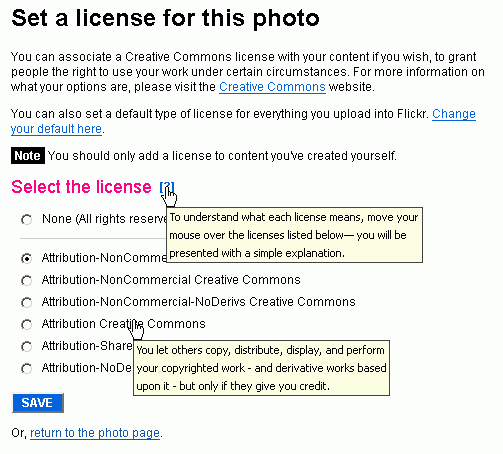
The second solution builds upon the first and is more effective and elegant than the earlier (again probably not in accordance with Flickr’s UI guidelines), as it takes care of the concern of increased cognitive load introduced by the first solution. The contextual help next to the ‘Select a license’ heading notifies the user that the explanation of each license will be given upon roll over of each license. The tool tips should be displayed immediately when the user hovers over each license with the mouse.
Solution 3

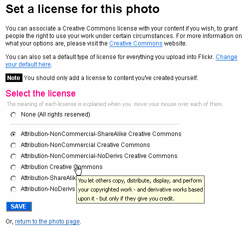
Similar to Solution 2, the user is notified that the explanation of each license will be given upon roll over of each license. However, we use hint text here which certainly is part of Flickr’s visual framework unlike contextual help, and thus this solution, like the following solutions, is a viable one.
It might not be as conspicuous as the contextual help icon due to its color but then again kinematic load is reduced in this case since the user does not have to use the mouse in order to view the instruction. While the solution might seem effective by assumption, a usability test of an interactive prototype should be used to validate it.
Next: Solutions 4 and 5 and an ending note


Leave a Reply